
UX Designer | HomeAdvisor
Service Professionals Profile
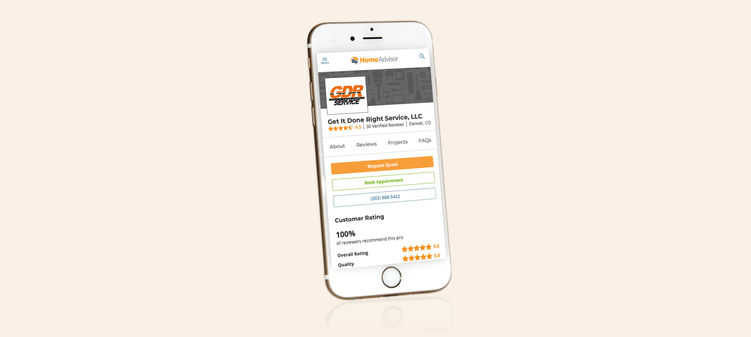
HomeAdvisor provides users with access to a directory listing of service professionals by home tasks. Users can access the directory to view profiles for specific service professionals. To improve the user experience on these profiles and increase conversion rates the page needed to be redesigned.
Problem
Users want to be able to easily access and digest a plethora of information about service providers so they feel confident to reach out/convert with one through HomeAdvisor.
Service professionals want to receive the highest quality leads.
HomeAdvisor wants to increase the conversion rate for these highly trafficked screens from 1% to 12%.
Goal
As a user, they want to be presented with the right information to help them narrow down the list of real estate professionals in order to convert with a real estate professional(s)
Solution
Evolve the structure and layout of the profile to improve scanability and understanding of existing content.
Make the calls to action clear, visible, and easily accessible anywhere on the screen.
Explore adding in additional elements that would be helpful for the user in selecting a professional.
Role
As lead designer, I was charged with rethinking and redesigning the user experience of the service professionals’ profiles. I focused on improving the layout of the screen, the structure of the content, the format of the sections, placement/copy of the calls to action, and ensuring users have all the information needed to convert.
Research, User Flow, Wireframes, Responsive Web, Prototype

Discovery
External research was conducted to understand the competitive landscape and to extract product-specific insights. We distilled the collective data to extract key findings, user pain points, and foundational functions to create a clear benchmark for the updated profile experience.
We applied the findings to the wireframes and it took several rounds of iteration with key stakeholders and user testing to distill the experience down to the core flow.
Key findings:
Users initially preferred a three-column design over a one or two-column approach. After improving the structure of the content based on user feedback the two-column design was a clear winner.
Prioritizing key elements such as ratings/reviews and project photos higher on the screen allowed users to access important elements quicker.
Hiding detailed elements behind an expand and collapse helped users focus on high-level decision-making content before diving into more logistical information about the service professionals.
Making the call to action more prominent on the screen and pinning them made it very clear to the user how they could contact the service professional.
Introducing new elements such as project cost and FAQs allowed the user to better understand what their project could potentially cost and gave them a better understanding of how the professionals operate.

Designs
I am currently partnering with the internal design team to visually bring the user experience to life.
Users can learn about service professionals specializing in specific home tasks to easily select and contact professionals about a project.
Conclusion
Throughout the design process, I collaborated with a number of stakeholders, product, design, and development teams to create the best experience for users researching service professionals on HomeAdvisor. As the design currently stands it is in design and will be launching in early 2020.